geom_line() in ggplot2 is used to create a line plot by connecting data points with a continuous line, which is ideal for visualizing trends over time. It is particularly useful for time series data because it clearly shows how a variable changes across ordered time intervals, allowing for easy identification of patterns and trends.
#| include: falselibrary(tidyverse)
── Attaching core tidyverse packages ──────────────────────── tidyverse 2.0.0 ──
✔ dplyr     1.1.4     ✔ readr     2.1.5
✔ forcats   1.0.0     ✔ stringr   1.5.1
✔ ggplot2   3.5.2     ✔ tibble    3.3.0
✔ lubridate 1.9.4     ✔ tidyr     1.3.1
✔ purrr     1.1.0
── Conflicts ────────────────────────────────────────── tidyverse_conflicts() ──
✖ dplyr::filter() masks stats::filter()
✖ dplyr::lag()    masks stats::lag()
ℹ Use the conflicted package (<http://conflicted.r-lib.org/>) to force all conflicts to become errors
library(RandomData)
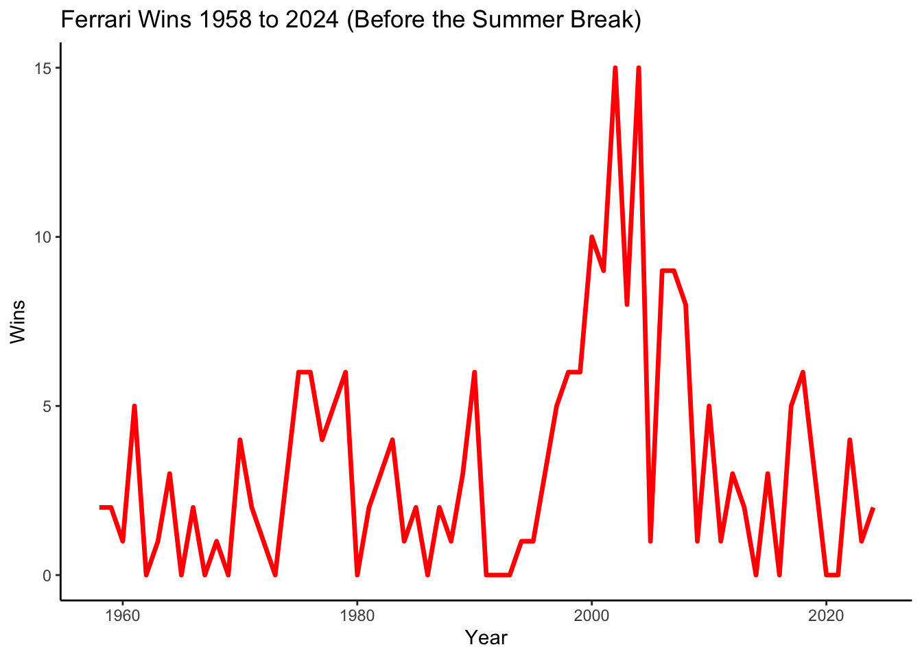
?constructors_stats# Calculate total wins per year for Ferrariferrari_wins <- constructors_stats |>filter(constructor =="Ferrari") |>group_by(year) |>summarize(total_wins =sum(max(constructor_wins)))ggplot(ferrari_wins, aes(x = year, y = total_wins)) +geom_line(color ="red", linewidth =1.2) +# Creates a red line plotlabs(title ="Ferrari Wins 1958 to 2024 (Before the Summer Break)", x ="Year", y ="Wins") +theme_classic()
aes(x = year, y = total_wins):
x = year: Puts the years on the x-axis.
y = total_wins: Puts the total number of wins on the y-axis.
geom_line(color = "red", linewidth = 1.2):
geom_line(): Creates a line plot instead of points.
color = "red": Adds a color to the line
linewidth = 1.2: Makes the line slightly thicker for better visibility.